
INTRODUCTION
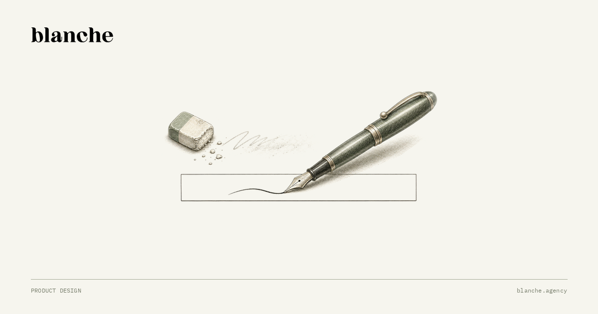
Placeholder text looks like a free win. The field explains itself, the form loses a row of labels, and the screen finally matches the clean mock-up. The trouble starts on the first keystroke. The words that told the person what to type vanish at the exact moment they begin typing, and they stay gone while that person checks, corrects and submits the answer.
The decision for a product team is not whether placeholder text is ugly or pretty. It is where each piece of guidance should live: the name of the field, the instruction that helps someone answer, and the example that shows a format. Each of those has a better home than the inside of an empty box.
What placeholder text actually is
The HTML standard is direct about this. It describes placeholder as a short hint shown while the control has no value, and states that the placeholder attribute should not be used as an alternative to a label. The same passage separates three mechanisms: a label is shown at all times, a placeholder only before a value exists, and other advisory text when the person asks for it.
That is a timing difference, and timing is the whole problem. A label answers “what is this field?” for as long as the field exists. A placeholder answers it only while nothing has been entered, which is the moment the question matters least. Once someone has typed “12/04”, the box no longer says whether it wanted a day-month date, a reference number or the last four digits of a card.
Where the cost lands
The GOV.UK Design System text input guidance tells teams not to use placeholder text in place of a label, or for hints or examples. Its reasons are practical: the text vanishes when typing starts, which hurts people with memory conditions and anyone reviewing their answers; not all screen readers read it out; and browser default styling often fails the WCAG 2.2 contrast minimum.
The W3C forms tutorial makes the same point from the accessibility side. It notes that placeholder text is usually displayed with lower contrast and disappears when users start entering text, and that assistive technologies do not treat it as a label. Under WCAG 2.2 success criterion 3.3.2, content that asks for input needs labels or instructions so people know what to enter. Grey text that disappears is a fragile way to meet that need.
Notice who pays. It is rarely the person filling a form for the first time on a calm afternoon. It is the person who was interrupted halfway, the person whose browser autofilled the wrong value, the person on a small phone screen comparing a field to a letter in their other hand. Those are the moments where support tickets and abandoned sign-ups come from.
The counterargument, taken seriously
There is a real case for placeholders. Dense tools such as search bars, chat composers and filter rows have little vertical space, and a one-field interface can be clear without a visible label: a search box next to a magnifying-glass button reads as search. Some design systems also use floating labels, where the placeholder animates into a small label above the value, precisely to keep the name visible after typing.
Those are fair exceptions, and they share a condition: the purpose of the field stays obvious after someone types into it. A lone search box passes that test. A floating label passes it only if the floated text is large and contrasted enough to read, and if the field still has a programmatic label. A six-field billing form with placeholders for “Name”, “Company”, “VAT number” and “Reference” does not pass, however tidy it looks.
A worked example: one field, three jobs
Take a hypothetical invoicing tool that asks for a purchase-order number. The first version has one box with the placeholder “PO number, e.g. PO-2026-0145”. It does three jobs at once: naming the field, saying where the number comes from and showing the format.
Split the jobs instead. The label becomes “Purchase order number”. A hint below the label, visible at all times and associated with the input, says “Optional. Copy it from the order your client sent you.” The example moves into that hint: “It usually starts with PO-”. The box is left empty, or keeps a short placeholder that repeats nothing essential.
Now the field survives every awkward moment. A person who pastes the wrong value can still see what was asked. An error message can point to the hint instead of restating it. Even if someone forgets the field is optional, the hint is still there when they decide to skip it. This connects to a decision we described for date fields: the format belongs to the source of the answer, so state it where people will still see it.
A ten-minute audit
Open one important form in your product and remove every placeholder in the browser’s inspector. Read the form again. Any field that no longer makes sense was relying on vanishing text for its meaning. Give it a visible label, move instructions into a persistent hint, and keep examples beside the field rather than inside it.
Then decide your rule in writing so the next component does not reopen the debate: labels always visible, hints persistent and programmatically associated, placeholders optional and never the only source of meaning. That rule costs a little vertical space. It buys a form that still explains itself after the first keystroke.
Sources checked on 15 November 2026: the WHATWG HTML Living Standard, the W3C WAI forms tutorial, WCAG 2.2 Understanding 3.3.2 and the GOV.UK Design System. The invoicing example is hypothetical and does not describe a Blanche client.