
INTRODUCTION
The Logo Is Losing Its Throne
Here's an uncomfortable question for every brand designer who's spent three months perfecting a wordmark: when did you last see a logo on a screen and feel something?
Not recognition. Not brand recall. Feeling.
The logo — that fixed, sacred, vector-perfect symbol — was engineered for a world of business cards, embossed letterheads, and signage. It excelled at those jobs. But that world is a rounding error now. Your client's brand lives inside a notification ping, a scrolling feed, a 375-pixel-wide viewport, a loading screen, a hover state. It lives in motion and in milliseconds. And a logomark, however beautifully crafted, was never built for that terrain.
The studios quietly winning the most interesting identity briefs right now aren't leading with logos. They're leading with type — specifically, with variable fonts that behave less like a fixed typographic choice and more like a living brand voice. This isn't a trend. It's a structural rethinking of what identity means when screens are the primary surface.
What Variable Fonts Actually Unlock for Brand Design
Most designers still treat variable fonts as a performance optimization — fewer HTTP requests, smaller file sizes, great. That framing undersells the technology by about a mile.
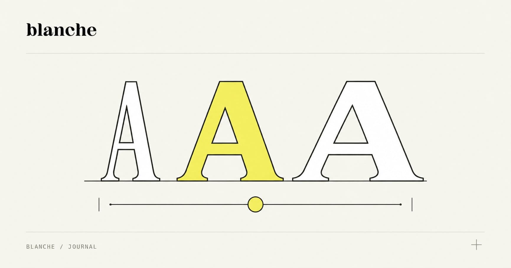
A variable font is, at its core, a design space. Within a single font file, you get a continuous spectrum of variation across multiple axes simultaneously. The standard OpenType axes — weight (wght), width (wdth), optical size (opsz), slant (slnt) — are just the beginning. Custom axes can control anything a type designer chooses to parameterize: x-height, contrast, serif curvature, even constructed letterform elements that behave like brand graphic devices.
Now think about that through a brand lens:
- Weight axis as emotional register — a headline that compresses from editorial-light to urgent-black based on content hierarchy
- Width axis as spatial intelligence — letterforms that breathe in hero moments and tighten in dense UI contexts without switching fonts
- Optical size axis as screen intelligence — type that optimizes its own legibility at 12px versus 120px, automatically
- Custom axes as pure brand expression — think of a font where a single slider moves letterforms from composed to kinetic, encoding personality as a parameter
Variable font axes aren't typographic utilities. They're brand personality levers — the difference between a brand that has a typeface and one that performs through type.
This is the paradigm shift. When you commission or license a variable font as a core brand asset, you're not choosing a typeface. You're defining a range of expression that the brand can move through fluidly — and that range becomes the identity system's most powerful differentiator.
Building a Type-Led Identity System: Process and Tools
Shifting to a type-led process requires rethinking the workflow from the first brief conversation. Here's how the most effective studios are approaching it:
1. Typographic Audit Before Any Sketching
Before a single logo concept is explored, conduct a thorough audit of where the brand actually communicates. Map every touchpoint — app UI, social templates, email headers, OOH, packaging if relevant — and note the type-to-logo ratio on each surface. In most digital-first brands, that ratio is overwhelmingly type. That data alone can reframe client expectations about where design investment should go.
2. Commission or License Strategically
For brands with the budget, commissioning a bespoke variable font is the highest-value design investment they can make. Studios like Commercial Type, Dinamo, and Klim Type Foundry work with agencies on custom and semi-custom typefaces that encode brand DNA at the glyph level. The result is an identity asset that is, by definition, ownable — something no logomark can claim once you account for the derivative nature of most mark design.
For clients with tighter budgets, the licensing landscape has matured significantly. Google Fonts now hosts dozens of high-quality variable fonts under open licenses. Fontshare by Indian Type Foundry offers production-grade variable fonts at zero cost. Hoefler&Co, TypeNetwork, and Monotype offer flexible licensing models for commercial brand use. The key is to evaluate axis range and custom axis availability, not just aesthetics.
3. Define the Brand Axis Map
Once you have your variable font, document which axis positions correspond to which brand contexts. This is your type axis map — as essential to the system as any color palette. It might specify:
- Hero moments:
wght 800,wdth 110, animated fromwght 200on load - Body and UI:
wght 400,opsz 14,wdth 100 - Alert or urgency states:
wght 700, custom tension axis at85
4. Build Component Libraries, Not Static Guidelines
Type-led systems live or die in the handoff. Build your guidelines inside Figma using variable font support (now robust as of 2023 updates), and deliver component libraries where axis values are wired to design tokens. Tools like Tokens Studio and Style Dictionary let you map font variation to semantic tokens that developers can implement consistently across React, Vue, or whatever stack the client runs.
Selling the Concept to Clients Who Think in Logomarks
The hardest conversation in type-led identity isn't about craft. It's about expectation management.
Clients arrive with a mental model inherited from decades of brand orthodoxy: logo first, color palette, typeface as afterthought. Shifting that model requires reframing the value proposition in business terms, not design terms.
Here's a pitch framework that works:
Lead with failure modes. Show them screenshots of competitor logomarks at 32px in a mobile nav bar. Show them how those marks become undifferentiated blobs. Then show how a distinctive typographic system — expressive, responsive, variable — stays legible and ownable at every scale. The logo is invisible where it matters most. The type never is.
Sell flexibility as ROI. A variable font system doesn't need to be resized, rasterized, or re-exported for every new context. It adapts. For a marketing team producing dozens of social assets a week, that's a measurable efficiency gain. Frame the type system as infrastructure, not decoration.
Use the Spotify or Netflix argument. Ask your client: when you think of Spotify, what comes to mind? Probably the green, the Circular typeface, the editorial headlines. The logo is somewhere in there, but it's doing supporting work. The typographic voice carries the identity. That's not an accident — it's a deliberate system decision. Most clients want to be Spotify. Show them the path.
The goal isn't to eliminate the logomark. It's to stop making it load-bearing when it was never engineered for the job.
Case Studies: Brands Where Type Does the Heavy Lifting
Bloomberg Media
Bloomberg's rebrand leaned aggressively into typographic identity — the angular, condensed slab-serif headline treatment is the brand. The logo appears, but the reading experience is the identity. Across terminals, apps, and editorial, it's the type that signals Bloomberg before any mark registers.
Figma
Figma's brand refresh centered on a custom wordmark, yes — but the real identity system lives in its expressive use of Inter with tight tracking, controlled weight hierarchy, and motion that's baked into transitions rather than added as decoration. The type behavior is the personality.
Recursive / Google Fonts
Less a brand case study than a proof of concept: Recursive, the variable font by Arrow Type, demonstrates how a single font file can shift between monospace and sans-serif, casual and formal, static and animated — across a continuous axis. Imagine a brand built on that range. The expression is endless; the system is singular.
Pangaia
The sustainable materials brand uses its typographic choices — a humanist grotesque pushed toward almost uncomfortable tightness — to do more emotional work than its relatively understated logomark. The type feels like the brand's conscience: controlled, considered, urgent without being aggressive.
Designing Identity for the Screen, Not the Business Card
We're not arguing that logos are dead. We're arguing that they've been over-promoted — elevated to the role of primary identity carrier in a world where they're increasingly a supporting player.
Variable fonts have matured to the point where they can anchor a complete brand system: expressive enough to replace illustration as mood-setter, flexible enough to handle every digital context without compromise, distinctive enough — when commissioned or chosen well — to be genuinely ownable.
The studios that figure this out first have a significant competitive advantage. Not just in the quality of work they produce, but in the value they can articulate to clients. A type-led identity system isn't cheaper than a traditional logo-centric one. Done right, it's more expensive — and worth every dollar, because it's built for the surfaces where the brand actually competes.
The next time a client brief lands with "we need a logo," try asking a different question: where does your brand spend most of its time?
The answer, almost always, is somewhere a logo can't carry the weight alone.
Start with type. Design outward from there. Build for the screen.
That's where identity lives now.